


The best Landscape photo that I took today

I think the best landscape photo i took today was this one. I like the way the cranes 🏗are in the background and how big they are compared to the people.
My landscape Photography mindmap

Homework


|
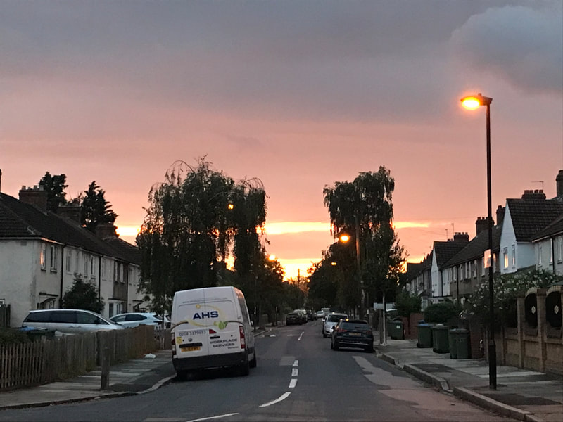
My 'best' photoI think this is the best landscape photo out of these ten because of the color scheme and layout. I like how the sunset is following the rule of thirds and the trees are in the background.
|
Bad landscape photos


These are bad landscape photos because in all of them there is something blocking the view. The main subject of the photos is not clear and none of them are following the rules of thirds.
Roger Fenton/Richard Prince comparison


Some prompts to help you:
- Describe what you can see in each picture - focus on the overall impression of the pictures and what you notice about them. What do the two pictures describe about the world?
- Identify the main similarities between these pictures?
- Identify the main differences.
- Explain which details in each picture strike you as most important?
- Explain how each picture makes you feel. What ideas or sensations do you have when you look at each of them? What is/are the source of these feelings/ideas? Where do they come from? What do the pictures suggest about landscapes and people?
- Explain which of these pictures seems (to you) to be most accurate or reliable as a source of evidence about something.
- Both of these pictures are famous partly because they are controversial. Can you suggest why?
In the first photograph, we can see that the ground is the main focus of the image. There are no living beings in this image, which makes it seem like it has been abandoned.There is a road leading to somewhere but we can’t see where it is leading to or when it ends. On the ground there are many round balls that look like cannonballs. This gives the impression that there has been a battle.The setting is quite tranquil in a sinister way and it looks like no one has been there in a while.Looking at the top third of the photo, we can see that the sky is pretty empty with nothing going on. We can’t see any clouds, birds, or the sun. Overall, I think that the image looks ominous and mysterious.
The main focus of the Richard Prince photograph is the sky and the silhouette of the man on his horse. We can’t see his face so his identity remains anonymous. We can’t see where this man is headed to or where he came from. In his hands he is holding a lasso, which could suggest that he is going to catch something - maybe an animal. The sky is a vibrant blue colour and the clouds are very big and bold compared to the rest of the photo. This photograph almost looks fake, as if it has been photoshopped or set up maybe. Both images have a sense of mystery to them, as we can’t see where the roads lead to or when they end.
The main focus of the Richard Prince photograph is the sky and the silhouette of the man on his horse. We can’t see his face so his identity remains anonymous. We can’t see where this man is headed to or where he came from. In his hands he is holding a lasso, which could suggest that he is going to catch something - maybe an animal. The sky is a vibrant blue colour and the clouds are very big and bold compared to the rest of the photo. This photograph almost looks fake, as if it has been photoshopped or set up maybe. Both images have a sense of mystery to them, as we can’t see where the roads lead to or when they end.
Disrupted Photos


Ray Metzker’s ‘Pictus Interruptus


Metzker’s landscapes and cityscapes were often disrupted by abstract forms that were made from the city or the land. In each photo, an object, an “interrupter”, is held up between the camera’s lens and the main subject. This makes each photo original and very mysterious as the subject is never clear and we don’t know what we are looking at. My favourite photo is the second one because it looks like a photo of a wall but it could also be a pavement.
Nature Landscape Homework
I took these photos on my phone around London and tried to include as much nature as possible. I took these photos from different angles in different locations. My favourite ones are the first two because i like the composition and the colours in the photo.


Landscape Photograms
This lesson we made our own pictograms. The task was to make landscapes using black and white card and include things that you would normally see in a landscape photo. I added mountains, trees, the sun, clouds, birds, and a road. After I finished cutting out my shapes, I moved them around a bit to see where they looked the best . Once I liked the composition, I glued it onto the white card. I then photocopied the pictogram and inverted it to create two different versions of it.


Photograms
Today I went into the dark room with my two landscape collages and created photograms. I placed my collage face down on the photographic paper and flashed the light onto it for about 18 seconds. I then transferred the photographic paper into the developer for 1 minute until I could see the full image. I then placed it in the “stop” solution for 30 second and then into the “fix” solution for 5 minutes. I then rinsed the paper under cold water to remove the solution.
My first few outcomes were not very good as they were very dark and blurry and I couldn’t see the shapes clearly. I tried doing them again, but this time I left the photographic paper under the flashing light for only 15 seconds. That made the picture come out slightly better but it wasn’t as good as I wanted it to be. I tried a few more times leaving the paper under the light for different amounts of time . With the help of my teacher, I applied a filter to the flashing light that prevented the light from being too intense. That was definitely the one that came out the best as the two colours contrasted more and the lines were clearer. I also put a piece of glass on top of the two sheets to make sure the light would shine evenly across the paper.
My first few outcomes were not very good as they were very dark and blurry and I couldn’t see the shapes clearly. I tried doing them again, but this time I left the photographic paper under the flashing light for only 15 seconds. That made the picture come out slightly better but it wasn’t as good as I wanted it to be. I tried a few more times leaving the paper under the light for different amounts of time . With the help of my teacher, I applied a filter to the flashing light that prevented the light from being too intense. That was definitely the one that came out the best as the two colours contrasted more and the lines were clearer. I also put a piece of glass on top of the two sheets to make sure the light would shine evenly across the paper.


Google Glitches - Brea Souders
Brea Souders is an American artist who takes screenshots on google maps of glitches in the photos that were made by the algorithm to take away anyone in the photos for privacy reasons. The algorithm made disrupted shadows and random body parts left in the image such as feet and knees. She takes screenshots of the glitches but still keeps the rest of the landscape in the background. Souders probably uses photoshop to alter the colours of the image and create her own version of the photos. The photos that she creates are different to "normal" landscape photographs and they make you think carefully about her thought process when making them.


Dafna Talmor
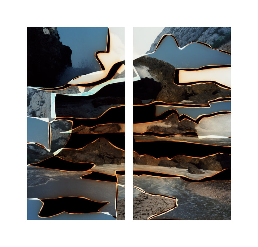
This is my favourite Dafna Talmor constructed landscape as it is quite mysterious and it the way she has made it seems very interesting. This looks like it was initially one united photo, but used a cutting tool to separate them. I find the techniques that she uses to create her landscapes very interesting and unique as she uses her own methods to create something entirely original. I like how she uses both digital and non digital methods to create her landscapes in a way that is intriguing and makes you want to ask question about the process itself and the actual outcome. She arranges these landscapes so that we don’t know where the original ones were taken and makes us want to know more about them.
Google glitches - continued


Abstract Advent 2021


Alice's Abstract Advent


Viviane Sassen
Viviane Sassen is a Dutch artist who has been widely exhibited and published. She is a photographer who works in both the fashion and fine art world. She is best known for her use of geometric shapes to create her pieces. In most of her fine art pieces you will find colourful rectangular-shaped pieces of plastic that seem like they are floating in mid air. She also uses mirrors to disrupt the reflection of the colourful plastic on the floor. Down below are some of her most popular photographs:


My response to Viviane Sassen:
Me and Lucia went around the school taking landscape photographs with the colourful pieces of plastic. We wanted to experiment with them in response to Viviane Sassen and see how we could make our own versions of them. We went around the school and tried putting them in different compositions and patterns. It was quite hard trying to hold all three of them up in the air


'Random' collages


Constructed landscape slides pt.1


Today we experimented with negative and positive film on 35mm slides that my teacher got on ebay. We had to take the original film photos and use the tools available to create our own versions of them. By using tape, colored cellophane, scalpels, cutting mats and two 35mm slides and ink, I created two of my own constructed landscapes. The first time around I only experimented with the cutting tools and layering the images to create something new.By putting the film against the window, the light shone through and the image became clear to me. I used a scalpel to scratch the surface of the image to create an outline of the main focuses in the films. It was difficult trying not to make a mistake and scratch a line where i didn’t want it to be. After putting my finished slide into the projector, I realised that the image did not look very interesting , and that it could’ve been altered to have more intricate details. The second time around, I used the scalpel to cut shapes in the film and scratched the surface to create different textures and to have random parts of the image missing. It was quite challenging to cut on such a small surface as I had to concentrate a lot and pay attention to all the small details.I used the colored cellophane to add color and highlight the parts of the image that i wanted to stand out. I also scrunched up tiny pieces of cellophane and placed it carefully on the image and added ink on top of it to create cool patterns on the surface. As the ink had not dried yet, when i put it in the slide and into the projector, the heat from the projector moved the ink around and changed how it looked. As it was my first time creating a film slide, I was very curious how it would turn out as I was unsure how the final outcome would look like until the very end when we looked at them through the slide projector.
Constructed landscape slides pt.2


Constructed landscape slides pt.3
|
|
|


Chemigrams research
Chemigrams were invented by a Belgian artist, Pierre Cordier in 1956, who discovered Chemigrams by putting nail polish on a piece of photographic paper. Chemigrams combine the physics of painting with wax and oil with the chemistry of photography using developers and fixers. They are made by creating an image on light sensitive paper such as photographic paper, without needing to use a camera. As photographic paper is sensitive to light, when you put chemicals on certain areas to create an image, and then expose the paper to light and put it in a chemical developer, certain areas go darker, causing the desired image to show. Once the person is content with their image, they place it in stop and then fix to take away the light sensitive layer from the paper so the image can be exposed to the light without any changes. There are many different ways to experiment with this photographic technique. For example, trying to use different chemicals and different types of light sensitive paper will give you different results.


Pierre Cordier’s work is extremely detailed and has various colour shades and different shapes and sizes. Many of his Chemigrams include earthy colours and could maybe be his own interpretation of nature. His images are very intricate, and has managed to create contrasting shades on the light sensitive paper. Cordier may have controlled the light hitting the paper and applied his chemicals to the paper very delicately, creating this complex form of art which he used to express himself.
Alice Cazaneve
This lesson, Alice Cazaneve came into school and taught us how to make a chemigram and developer. We made a developer for the chemigrams by mixing rosemary tea , vitamin C and soda crystals .


John Divola
John Divola is an American contemporary visual artist. He works in photography and describes his art as looking at the abstract and the specific. His work changes from buildings to landscapes but mainly focuses on challenging the boundaries between fiction and reality, as well as the limitations of art to describe life.


Click here to edit.
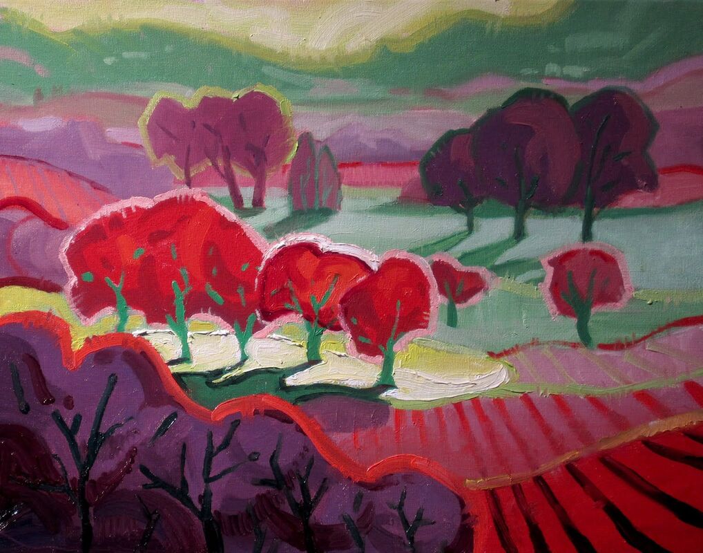
Matisse
Matisse was the co founder of the fauvism art style, and one of the most influential painters of the 20th century. Fauvism is an expressive art style which uses unrealistic colour schemes to depict natural scenery.


Personal Project Evaluation
For unit 1 i have researched numerous artists and photographers such as Ray Metzker and Matisse. I feel like Matisse's work reflects my work the best, as i have taken inspiration from him and his projects. I find his work particularly interesting as his photos don’t look like ordinary photos, but have been disrupted instead. Matisse makes decisions of changing the color of one section of his photograph to make it seem as though it's 'not real'. For example, in his images, Matisse uses unrealistic color schemes to depict natural sceneries. I found this idea very interesting , and it stood out to me so i decided to further my research and attempt making my own versions of them.
For this project i wanted my piece to reflect how us as humans are destroying the planet, by not wasting any products and reflecting my thoughts into my piece. At first i wasn't too sure about what i wanted to do for my final piece, so i went online and did research on two artists, Matisse and John Divola. Both artists have very interesting ideas on landscape photographs, and the way their projects mirror their thoughts and ideas on making photographs seem 'fake' , is something i wanted to try include in my photographs. To begin with, i went onto Pinterest and my camera roll to find landscapes of the ocean, and printed them out onto and A4 sheet of paper. I then cut out everything in the background so i would only be left with the sea, which was important so i could photocopy that section in different colors. I tried out many different colors but i found the one that contrasted the most with the color of the sky and the grass, was red. I then made another photocopy of the landscape in its original color and stuck the red sea on top of the original sea. The idea behind the color red, is that red represents violence.
For this project i wanted my piece to reflect how us as humans are destroying the planet, by not wasting any products and reflecting my thoughts into my piece. At first i wasn't too sure about what i wanted to do for my final piece, so i went online and did research on two artists, Matisse and John Divola. Both artists have very interesting ideas on landscape photographs, and the way their projects mirror their thoughts and ideas on making photographs seem 'fake' , is something i wanted to try include in my photographs. To begin with, i went onto Pinterest and my camera roll to find landscapes of the ocean, and printed them out onto and A4 sheet of paper. I then cut out everything in the background so i would only be left with the sea, which was important so i could photocopy that section in different colors. I tried out many different colors but i found the one that contrasted the most with the color of the sky and the grass, was red. I then made another photocopy of the landscape in its original color and stuck the red sea on top of the original sea. The idea behind the color red, is that red represents violence.
